

Festival Latino’s new 25th anniversary branding was created by Jeremy Rosario Maldonado, a Columbus-based creative director, fine artist, and visual communicator. Born in Puerto Rico, Jeremy says the new logo was inspired by a Saludo or “celebratory greeting.”
We talked to Jeremy about his creative process and inspiration behind the new branding.
What was the process like to redesign the Festival Latino brand/logo?
The redesign process began with a visual landscape analysis of logos used on Latino festivals’ across the US.
I wanted to see and understand the meanings associated with iconography, typography and colors often used in this space. I saw a lot of country specific icons that excluded other hispanic groups. That insight helped guide areas of investigation for the branding development. The goal was to create a logo that not only celebrates all latino cultures, but also invites all people to be part of the Festival Latino 25th year celebration.
How long did it take you to redesign the new logo, and/or how many drafts did you go through before deciding on the final design?
The project took a month to complete. The early presentations included visual discoveries based on traditions from Central, South America and the Caribbean. We created pencil sketches to illustrate the different conceptual angles. The CAPA team carefully considered each creative solution, as we evaluated the meaning of the icons. Once concepts were selected, I began the design process that included color palette options and refinement of the chosen logo.
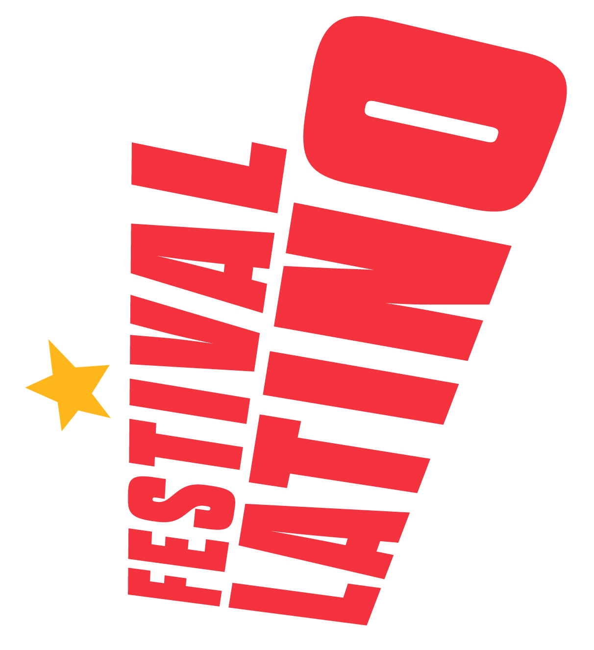
What was your inspiration for the new logo?
The new logo is simply inspired by a Saludo or “celebratory greeting.” Each Latin country has a unique Saludo. ¡Wepa!, ¡ño!, ¡Arriba!, ¡Chuleta!, ¡Paisa! to name a few, identify latinos to their place of origin. The design of the logo brings that emotion in the typography arrangement and colors used. The logo shape reminds us of an exclamation point excited to have people join the celebration.
What did you hope people would take away when looking at the new logo?
I want people to feel welcome to be part of a “new home away from home” by enjoying the things they miss the most from their native countries. Also, a want the general public to discover latin music, food, and great company at this year’s Festival Latino!